


As the popular saying goes, “the devil is in the details,” and this is particularly true when designing our digital communication platforms.
Many companies are comfortable having a reasonably functional and affordable website. The truth is that several paid and even free platforms now allow virtually anyone—and by that I mean anyone who is not a web designer—to build a website, rank in search engines, and create a sales channel. However, the saturation of websites, growing competition, and the number of businesses seeking opportunities through digital channels demand a higher and more differentiated standard in this increasingly competitive environment.
This is where I always recommend taking our website management to the next level by studying what is known as “Web Usability.” This concept examines how our website flows for its audience. It is based on a principle introduced by Steve Krug in his book “Don’t Make Me Think,” where he explains that we do not read web pages—we “scan” them. The way we absorb a website’s content depends on a series of conventions, including the positioning of certain elements and how we arrange and prioritize text and paragraphs.
Based on the above, I developed a methodology for analyzing website usability. It is a somewhat scientific process that reveals the details that genuinely make a difference and consists of the following steps:
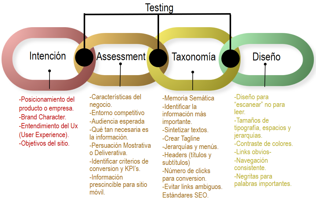
- Intent
It is important to determine whether the positioning of the brand or business and its brand character correspond with what visitors see on the website. This may sound somewhat obvious, but believe me, there are often major disparities between what a brand represents and what its website communicates.
- Assessment
You must understand the characteristics of the company or business, the intensity of its competitive environment, its intended audience, and the website’s true objectives. Some sensible websites aim only to inform rather than sell, while others are designed to generate conversions but communicate precisely the opposite.
- Taxonomy
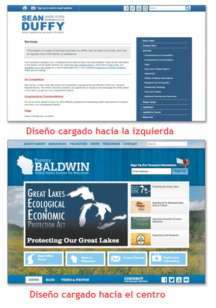
This stage involves applying semiotic techniques—both in visual form and underlying meaning—to maximize a website’s communication. It concerns established conventions and the positioning, sizing, and use of visual elements, as shown in the following image taken from Susan Weinschenk’s book “100 Things Every Designer Needs to Know About People.” It illustrates how different uses of symmetry can significantly influence the attention a message receives and how it is perceived.
- Design
This final stage of understanding usability consists of evaluating content flow based on the conventional way consumers read a website. Established positioning standards exist, such as placing the logo in the upper-left corner, which—whether we like it or not—is where visitors begin reading the site.
Finally, testing is important at every stage and throughout several phases of a website’s lifespan. I would say it should be an ongoing practice. This is where the “The Devil Hides in the Details” . In the example below, we see a series of tests performed on a website in which the model’s gaze and demeanor significantly affected the site’s visibility and user interaction:
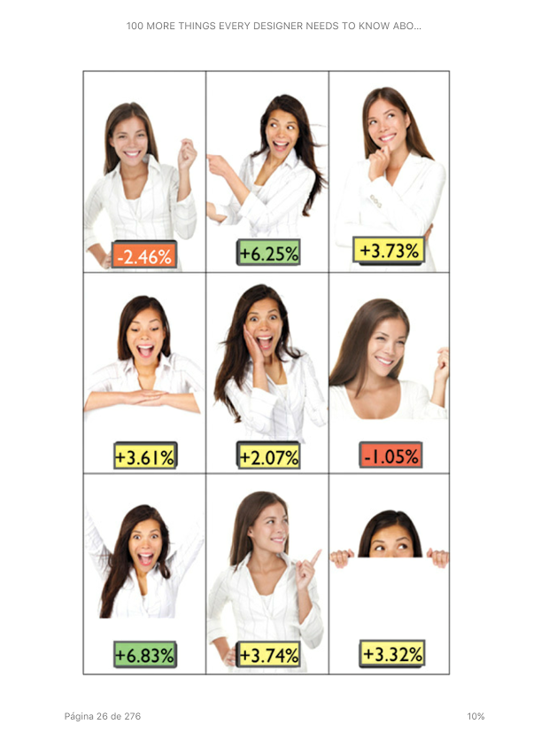
This is extremely important: the model’s position, gesture, gaze, and demeanor produced results that varied by as much as eight percentage points.
For these reasons, web usability will become increasingly important because building a standard website will no longer be enough to compete and stand out in the digital jungle.
Source: merca20.com/el-diablo-se-esconde-en-los-detalles-de-tu-sitio-web
[/av_textblock]
[/av_one_full]